Every week someone holds up a freshly printed flyer and says the blue looked brighter on the laptop. They are right, and nothing is broken. Screens and presses make colour in opposite ways, and a few habits keep the surprise small.
Light versus ink
A screen mixes red, green and blue light, starting from black and adding light until it reaches white. A press lays cyan, magenta, yellow and black ink on white paper, and each layer takes light away. Some colours a screen can show, especially electric blues, neon greens and bright orange, simply cannot be made from four inks on paper.
Convert early, not at the end
If you design in RGB and the colours are converted to CMYK at the printer, the software picks the nearest printable colour, and it may not pick the one you would have chosen. Set your document to CMYK from the start, or convert it yourself and adjust anything that turned dull.
For logos with a strict brand colour, give us the CMYK values your designer specified, and we print to those numbers.
Paper and finish matter too
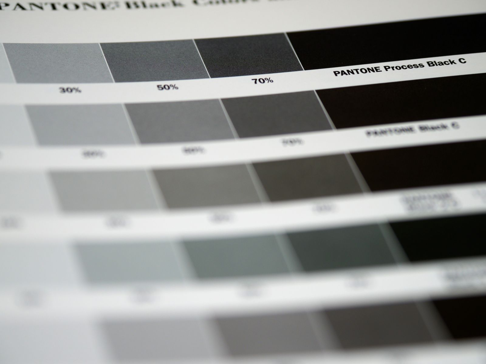
The same file printed on gloss and on uncoated paper looks different. Uncoated paper absorbs more ink, so colours look darker and a little softer. Rich black, a mix of all four inks, looks deeper than plain black on large areas, but it should never be used for small text, where the slightest misregistration makes letters look blurry.
Ask for a printed proof
Our free digital proof checks the layout, the spelling and the cut lines, but it is still shown on a screen. When colour really matters, for a brand launch or a large run, ask for a printed hard proof on your chosen paper. It costs $15, takes a day, and is credited to the order.